*** Originally posted on the Adaptive Path Blog ***
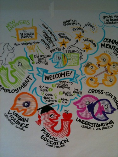
This weekend I had the pleasure to attend UX for Good in Chicago. It was an amazing event, spearheaded by Jason Ulaszek and Jeff Leitner, that focused on solving problems for five social causes: unemployment, urban violence, public education, community mental health, and cross-cultural understanding. I was part of the urban violence team.
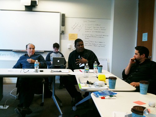
There were nine of us experience designers, a visual designer, and a kick-ass volunteer coordinator. We worked with a group called CeaseFire, based in Chicago. CeaseFire is a campaign that is tackling the problem of urban violence by treating it as a public health problem. Their premise is that if you can stop the violent behavior, and you can shift society’s norms around violence, there will not be as many shootings and killings. They have a network of interrupters, outreach workers and more who go into high-risk neighborhoods and work with the individuals most at risk for causing violence. They support those individuals however they need to, to get them to put down the guns. There is a movie called The Interrupters that just premiered at Sundance that focuses on the work that they do. Our challenge was to look at ways to educate the larger community about the work CeaseFire is doing, to change the larger community’s perception of violence, and channel their support of CeaseFire.
Our team spent the 14 or so hours we had trying to better understand the problems that CeaseFire has, how they work, and what kind of help they need and want. We developed a whole host of ideas of how Well Intentioned Individuals can participate and support CeaseFire.
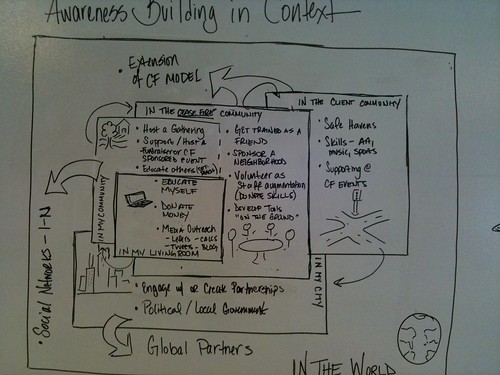
We also developed a model for interaction and context. This model shows the different levels of engagement that can be taken in the different contexts. The model starts in the center with the actions a person can take in their living room, such as educating themselves, donating money and blogging about CeaseFire. It expands out to actions they can take in their community, the CeaseFire community, the client community, their city, and lastly the world. This model provides a framework that the various ideas we came up with can fit into.
Most of our team members are local to Chicago. They will be following up with different members of CeaseFire to see how these ideas can be put into motion. There is a lot of work to be done, but the initial connections have been made. I’m curious to see how things develop.
One thing for sure is that the conference has changed me. Listening to the stories and watching the videos of the work the interrupters and outreach workers has changed the way I think about my city, San Francisco, and neighboring Oakland. I think all the participants of UX for Good were profoundly touched by the causes and teams they worked on. While the organizations we worked with certainly benefited from participating, I think it’s the effect that work had on us individually that will prove to be the most important.

Recent Comments